Style Is More Than the Subject
Two people can ask for the same subject and leave with tattoos that look nothing alike.
A rose can be bold traditional, delicate fine line, dark black and grey, highly illustrative, neo-traditional, or part of a larger color composition. The subject tells the artist what the tattoo is about. The style determines how that subject is translated visually.
That distinction matters because artists do not all draw the same way.
The strongest tattoo usually happens when the idea lands with an artist whose natural visual language already matches the direction you want. You should not need to force a fine-line artist to work like a traditional tattooer or ask a bold color artist to imitate someone else’s black-and-grey approach.
The portfolio should already tell you whether the match makes sense.
The Complete Guide to Getting a Tattoo at Against the GrainBlack and Grey Tattoos
Black and grey work uses black ink, diluted values, negative space, and shading to create depth without relying on color.
That can mean many different things. Some black-and-grey tattoos are realistic and smooth. Others are illustrative, graphic, soft, dark, high-contrast, or built around bold linework.
The strength of black and grey is not that it is automatically more serious or timeless than color. It is that removing color puts even more attention on composition, contrast, texture, and value.
When looking at an artist’s black-and-grey portfolio, pay attention to how dark areas are separated from skin breaks, how readable the tattoo is from a normal distance, and whether the style fits the subject you want.
A portrait, botanical piece, skull, animal, religious image, or abstract design can all live in black and grey, but they do not need to be approached the same way.
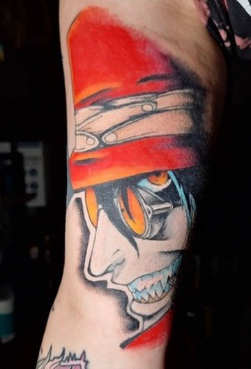
Color Tattoos
Color changes the design problem.
The artist has to think about hue, saturation, contrast, neighboring colors, skin tone, and how the palette works as one composition. Strong color tattoos are not simply black-and-grey designs with color filled into empty spaces.
Some color work is bright and graphic. Some is muted. Some uses only a few controlled tones. Traditional and neo-traditional tattooing can use color very differently from illustrative work.
If color is important to you, look at an artist’s actual color portfolio. Do not assume someone who is excellent in black and grey will automatically approach color the way you want.
It is also useful to think about how the tattoo will live next to your existing work. A new highly saturated piece can feel visually separate if the rest of your collection is soft black and grey. That may be exactly what you want, but it should be intentional.
Traditional Tattooing
Traditional tattooing is built around clarity.
Bold outlines, simplified shapes, readable silhouettes, controlled palettes, and strong contrast are all part of why traditional designs have remained visually powerful for so long.
The style works because it does not depend on microscopic detail to make an impact. The artwork is designed to read immediately and hold its structure.
Classic subjects include roses, daggers, swallows, panthers, snakes, hearts, eagles, skulls, ships, and countless variations that artists continue to reinterpret.
Traditional does not have to mean copying an old sheet of flash exactly. A skilled artist can use traditional visual language while still creating something specific to the client and placement.
Neo-Traditional Tattoos
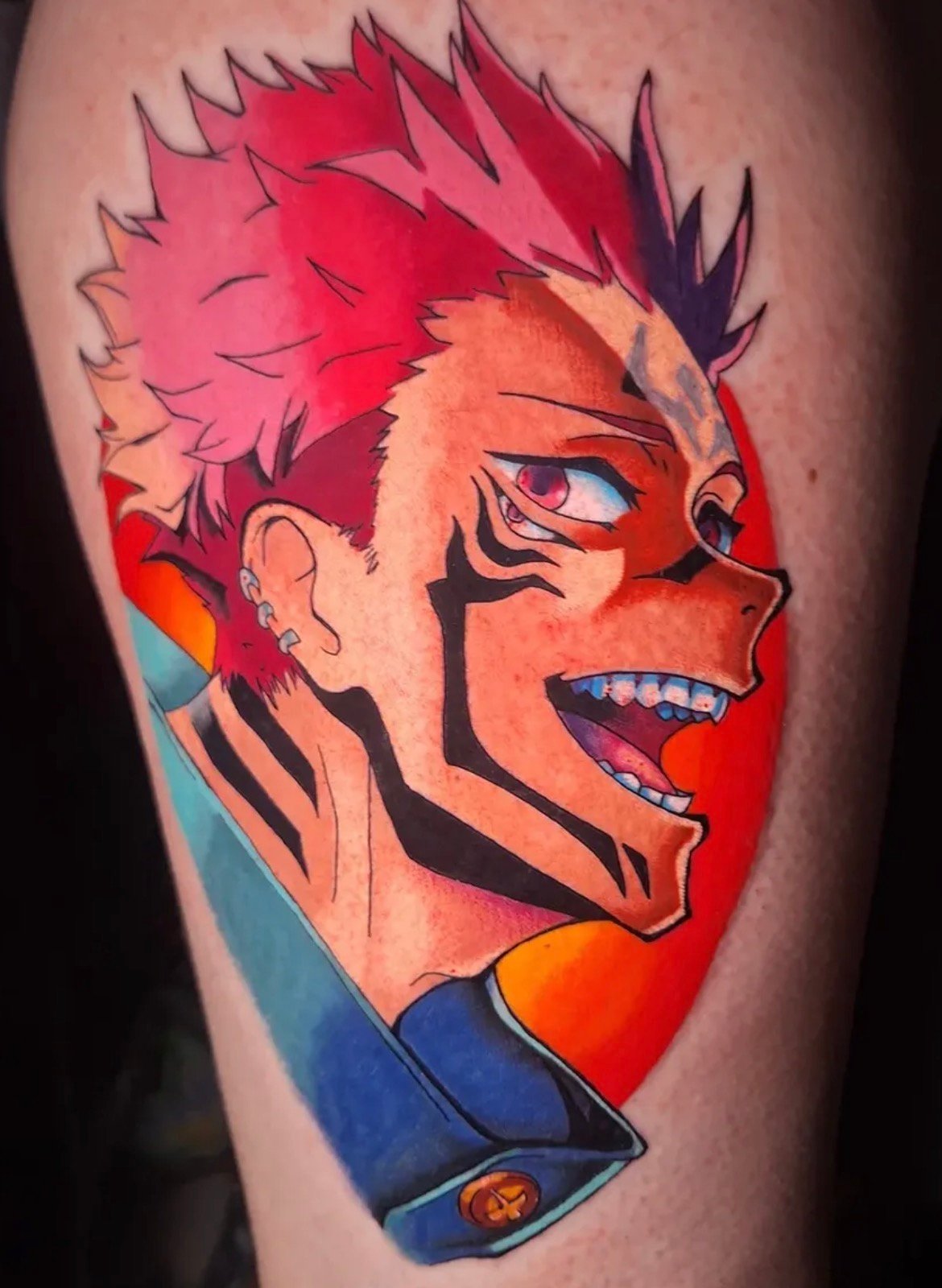
Neo-traditional work keeps some of traditional tattooing’s structural strengths while giving the artist more room for detail, expanded color palettes, dimensional shading, decorative elements, and complex compositions.
You may still see bold outlines and clear shapes, but the finished piece often has more texture, depth, and visual ornament.
It can work especially well for subjects that benefit from a strong graphic foundation but need more complexity than classic traditional tattooing usually allows.
Animals, portraits, botanicals, mythical subjects, and decorative compositions can all fit naturally into a neo-traditional direction.
The term covers a broad range, so the artist’s portfolio matters more than the label. Two artists who both describe work as neo-traditional may still have dramatically different approaches.
Fine-Line Tattoos
Fine-line work uses thinner line weights and often a lighter visual touch.
That can create elegant, subtle tattoos, but fine line is not simply “normal tattooing made smaller.” Scale and detail still matter. A tiny tattoo with too much information can lose clarity as it settles and ages.
Good fine-line design understands restraint. The amount of detail has to fit the available space, and the placement needs to make sense for the type of linework being used.
Botanicals, ornamental pieces, small illustrative work, symbols, lettering, and delicate compositions can all work well in a fine-line direction.
If you are choosing fine line because you want the smallest possible tattoo, talk to the artist about what size the artwork actually needs. Sometimes slightly larger is the difference between a design that merely looks delicate when fresh and one that stays readable later.
Read the Tattoo Placement & Pain GuideIllustrative Tattooing
Illustrative tattooing is a broad category because it describes an approach more than a strict rule set.
The work may borrow from drawing, engraving, comic art, printmaking, botanical illustration, realism, or graphic design. It can be black and grey or color, delicate or bold.
What ties illustrative work together is the feeling that the artist is translating a drawn visual language directly into tattooing.
This can be especially strong when you want a tattoo that feels authored rather than locked into a rigid historical style.
Because the category is broad, portfolios matter. Do not choose an illustrative artist based on the word alone. Look at the actual way they draw and compose tattoos on the body.
Lettering and Script
Lettering tattoos look simple until they are not.
The typeface, spacing, line weight, size, placement, and length of the phrase all affect how well the tattoo reads and ages.
A short word on the forearm is a different design problem from a long quote around the ribs. Small script can become difficult to read if the letters are compressed too tightly. Decorative lettering may need more room than expected.
Spelling should be checked more than once. If the lettering is in another language, verify it independently before the appointment.
An artist doing strong lettering understands that the tattoo is not just text. It is typography on a moving body.
Cover-Up-Minded Design
Cover-ups are not a separate visual style in the same way traditional or fine line is, but they require a different design mindset.
The existing tattoo determines what is possible. Darkness, shape, color, placement, and density all become part of the new composition.
That means the style you prefer may need to adapt to what is already there. A light, delicate design may not be capable of controlling a dense dark tattoo without additional strategy.
Sometimes a rework is better than a full cover. Sometimes the new tattoo needs to be larger. Sometimes fading an old piece first can create more options.
Explore Cover-Ups & ReworksCan Tattoo Styles Be Combined?
Yes, but the result should still feel intentional.
Artists regularly borrow techniques from multiple traditions. A piece may use illustrative drawing with black-and-grey shading, traditional structure with a broader palette, or fine-line elements inside a larger composition.
The risk is not mixing styles. The risk is trying to satisfy every reference image at once.
If one reference is realism, another is bold traditional, another is tiny fine line, and another is ornamental, the artist needs to know which qualities actually matter to you.
Use references to communicate priorities rather than asking for a collage of unrelated visual systems.
How to Choose a Style When You Are Unsure
Start with what you already respond to.
Save tattoos you genuinely like and then look for patterns. Are the lines bold or delicate? Is there heavy black? Is the work colorful? Is it realistic or clearly drawn? Do the compositions feel simple or dense? Do you like tattoos with large open areas or highly filled backgrounds?
You may discover that the subject matter changes but the visual treatment stays surprisingly consistent.
That is useful information.
Then compare those preferences to artist portfolios. The right artist may help you name the style, but the name itself is less important than finding work that consistently looks like something you would be proud to wear.
Meet the Artists at Against the GrainStyle Should Serve the Tattoo
Do not choose a style only because it is trending if it fights the idea, placement, or scale.
The strongest direction is the one that lets the subject read clearly, fits your body, matches the artist’s strengths, and still feels like you after the trend cycle moves on.
Bring references. Bring questions. Bring a sense of what you like.
You do not need to arrive knowing every style label. That is part of what the consultation can help clarify.